Half of the world population are internet users today; and of the web users, more than half (55.56% to be precise) are mobile users.
You can simply imagine the shapes and sizes of all the mobile devices (in millions) through which websites are accessed. It thus becomes a challenge to deliver a great experience irrespective of the device. So, how do you achieve this? Through ‘Responsive Web Design’ i.e. RWD. Ethan Marcotte described this term for the first time in 2010. The term then went ahead to massively impact the website design & development industry.
So, what exactly does it mean when you say a Responsive Web Design, how does it work? How do you know that your existing website is RWD? Well, Quora Web Solution as a Responsive Website Design Company has got a Cheat Sheet for you to better understand RWD. So, let’s get started.
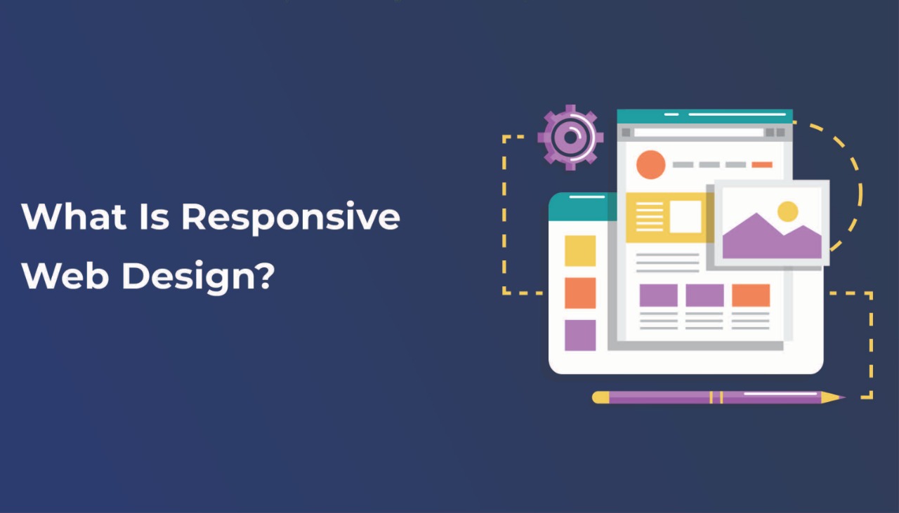
What is Responsive Web Design?
Responsive Web Design or RWD is a modern approach to website designing wherein web pages and websites can be displayed across all devices. Thus, no matter if the website is viewed from a mobile, tablet, iPad, laptop, desktop – irrespective of screen size – the website adapts automatically to fit the screen. To put it simply, a Responsive Web Design can render your website to be viewed from any type and size of the screen.
How does Responsive Web Design work?
In Responsive Web Design, the designer/developer uses CSS (Cascading Style Sheets) and adds pixel values called the ‘breakpoints’ to it. The breakpoints are mostly based on the screen width and determine the site layout at particular screen size.
The website design and content adapt to provide the best possible layout and user experience at the breakpoints. Designers make a change to the website content/design’s appearance at the breakpoints. Thus, as they increase or decrease the screen size, the designer will add breakpoints to prevent the content from looking misaligned. (It's easier to begin mobile-first content designing and then increase the size to reach that of a desktop/laptop.)
Designers tend to keep all the major breakpoints i.e. the most common screen sizes in mind and begin by adding the breakpoints for those sizes first. After adding the breakpoints, they then apply one design above a breakpoint and another below it. The Responsive Web Designers thus design the web pages so that the elements on them reshuffle themselves as the viewing screen increases or decreases. This is helpful so that there is no need to design and develop different sites for different-sized devices.
Hope this explains the working of Responsive Web Design. Now that you completely understand RWD, let's see why you would want one and how do you determine if you already have an RWD website.
What are the benefits of a Responsive Web Design?
Responsive Web Designs are beneficial not only for Web designers and developers but also for business owners. Listed below are some of the benefits that RWD offers –
-
Gets you higher traffic & high conversions: As responsive websites can be accessed from any device, there will be more traffic flowing in who are users of different devices. Also as RWD enables the best user experience, it’ll lead to higher conversions.
-
Reduced bounce rates: Responsive websites are designed to give optimum user experience and layout for all screen sizes, so that the chances of visitors bouncing back reduces.
-
It is great SEO: Google Search Engine crawlers have become mobile-first and thus mobile-friendly websites are appreciated. All in all responsive websites are good SEO for sure.
-
Keeps the design consistent: Instead of a responsive website you could always develop a traditional website and another mobile-friendly one, however, the design and look won’t be the same. However, Responsive websites can keep the design constant across any device.
-
Enables easy maintenance and monitoring: A single website that is responsive instead of multiple traditional and mobile ones will make monitoring easier. Also, you have a single code that is adept for all screen sizes, and thus maintenance too is easy.
With so many benefits, it is obvious that having a Responsive Website is a must. If you are yet to get your website developed, you can directly go for RWD, however, if you have an already existing website, check out if it's responsive. How to do that? We are explaining below.
How to determine if your Website is Responsive?
To see if your existing website is responsive, you can simply open your website in Google Chrome, open the Chrome DevTools (Ctrl+Shift+I), and then Toggle the Device toolbar (Ctrl+Shift+M). After that, you can simply view your website from any device to determine if it is responsive.
Another option you have is making use of the Free Mobile-friendly test tool provided by Google. Of course, you need to remember that a mobile-friendly website doesn’t always mean it is responsive. There are a few other web design approaches to create a mobile-friendly website too.
In the end, if you don’t have a responsive website, the best option would be to hire a Responsive Website Design Company. Then you can get your responsive website developed that will benefit your businessy.


Post Comments